When I Don’t Know Where to Start with Color, I Reach for This Book
If building a color palette feels overwhelming, this vintage-inspired guide is a game-changer.
Published On
Each week, interior designer, artist, and self-proclaimed color obsessive Lu Loveless shares a peek into her design process—whether it’s a smart trick she swears by or a favorite resource from her personal folder. This week, she’s starting with the basics: how to confidently choose a color palette.
Experimenting with color can feel overwhelming—especially when you’re trying to build a palette from scratch. You think you love green until you realize there are a thousand shades of green, and suddenly your cozy living room idea turns into a full-on existential crisis in the paint aisle. That's why I like to have a few reliable tools close.
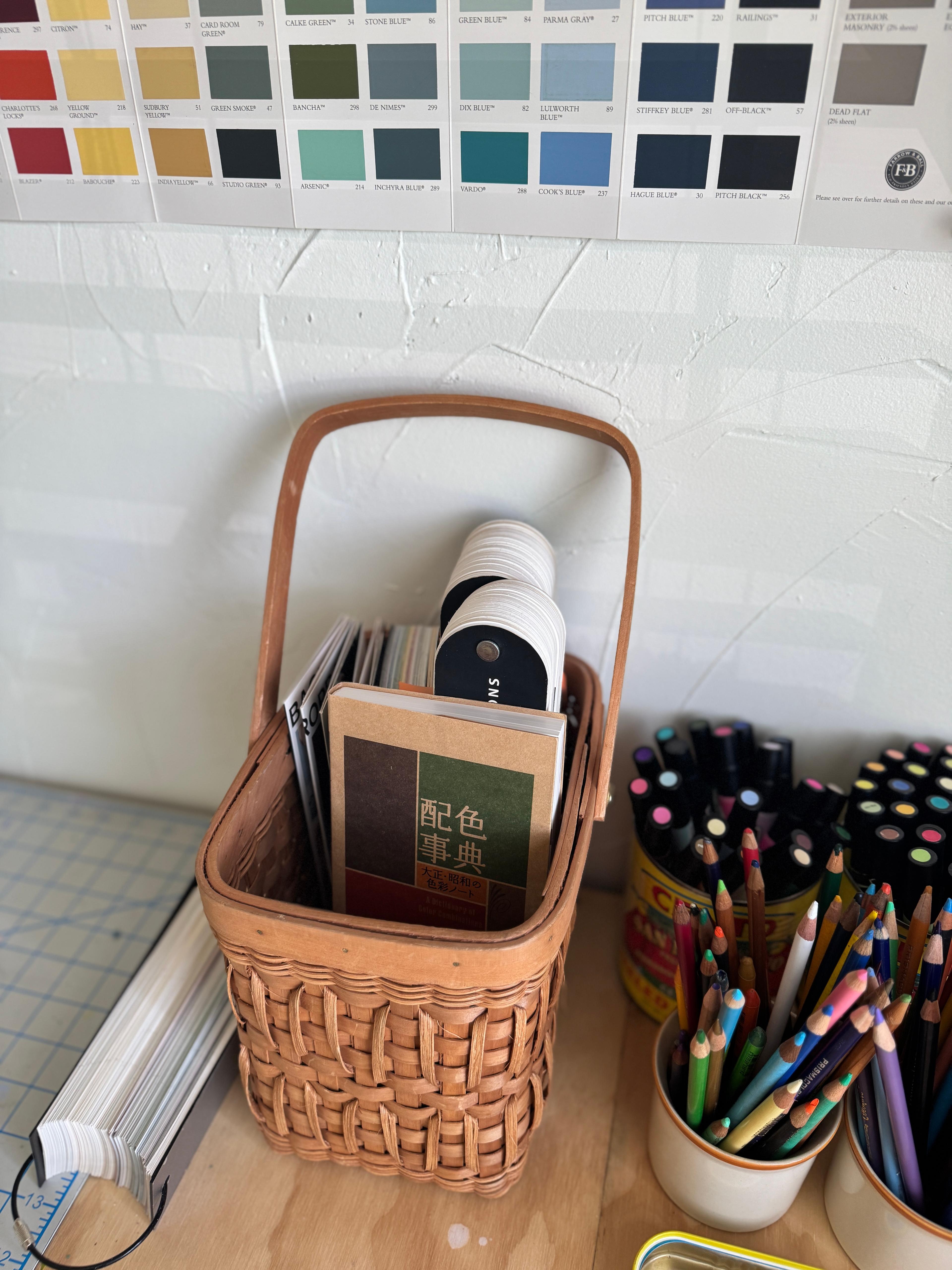
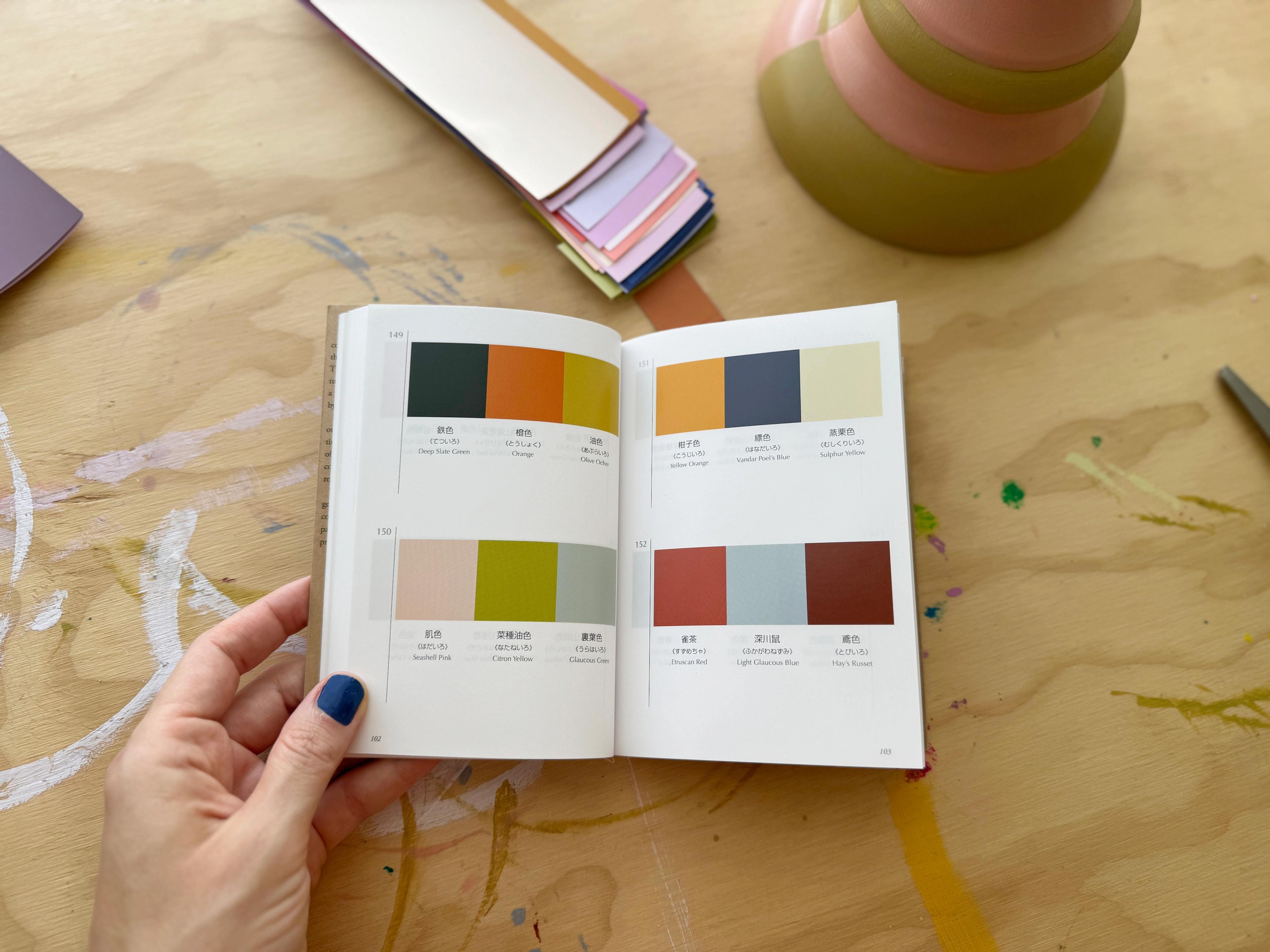
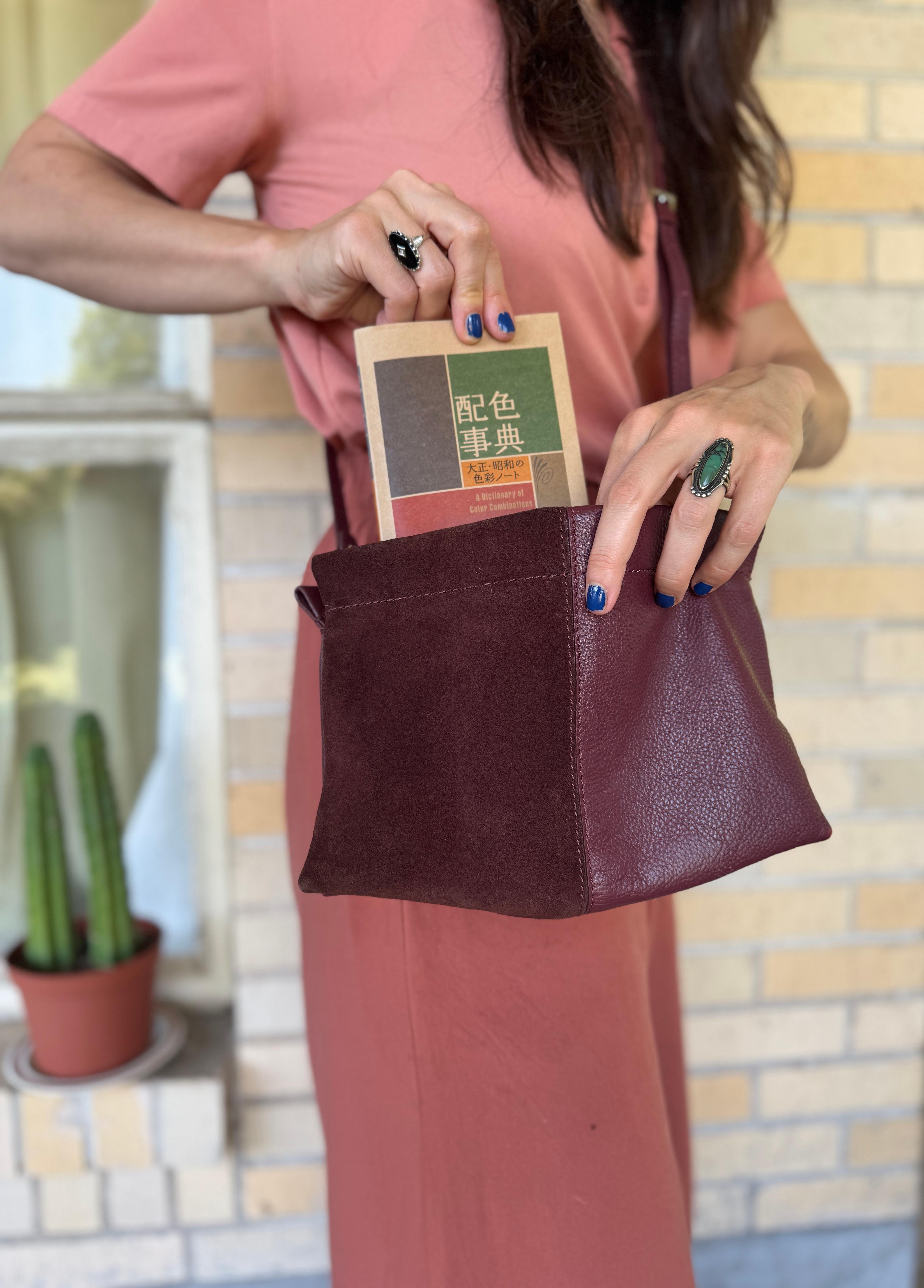
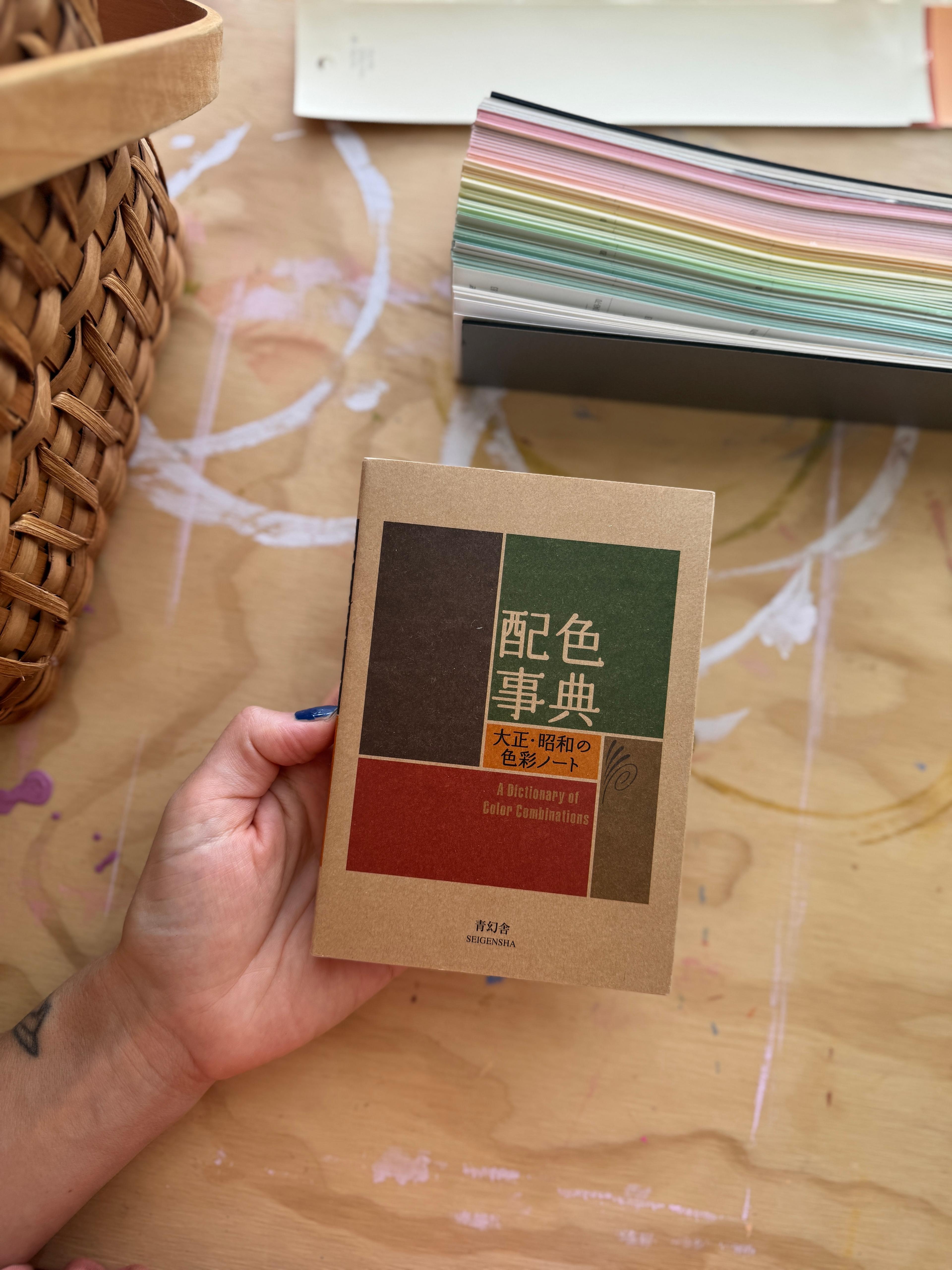
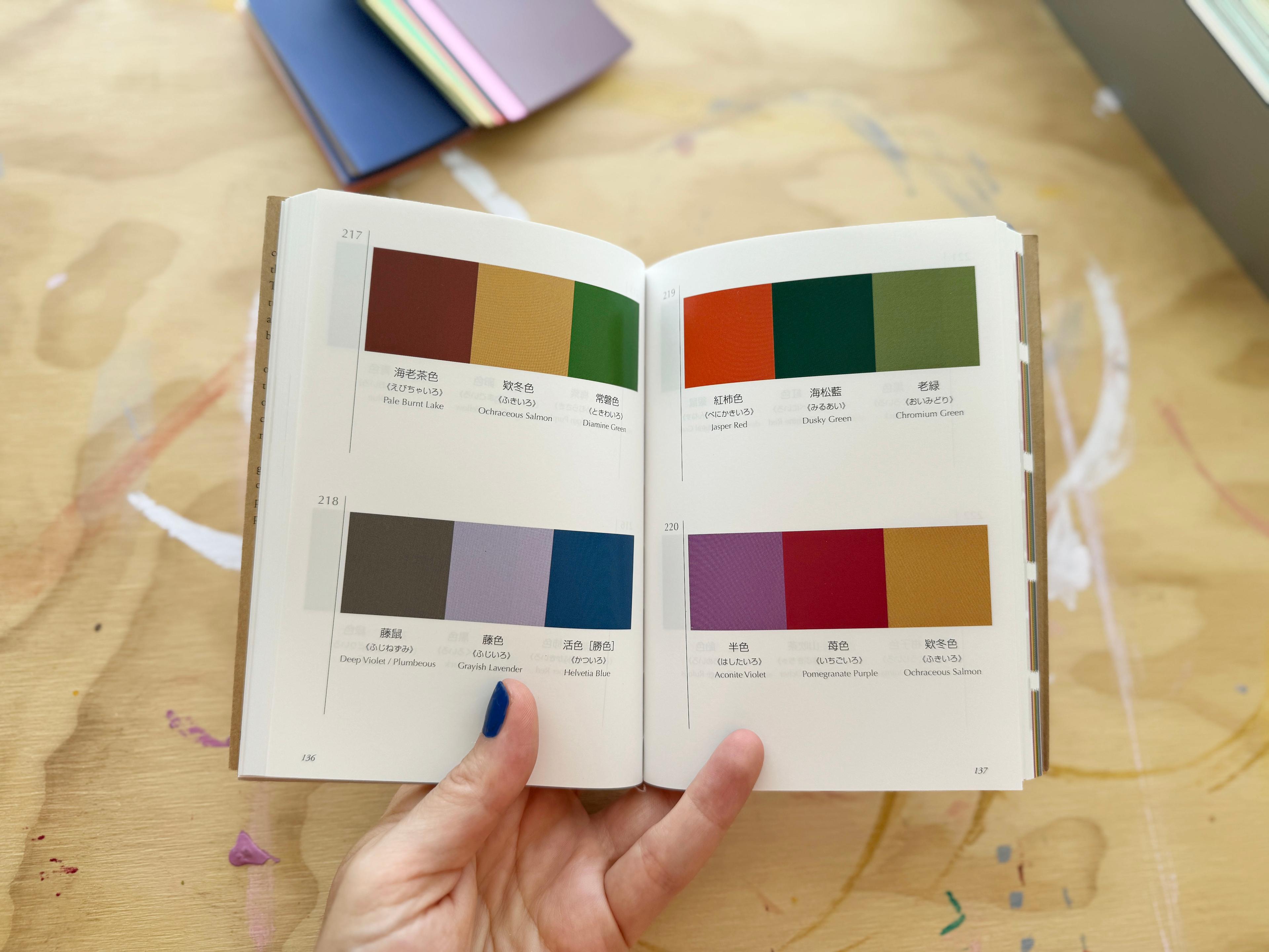
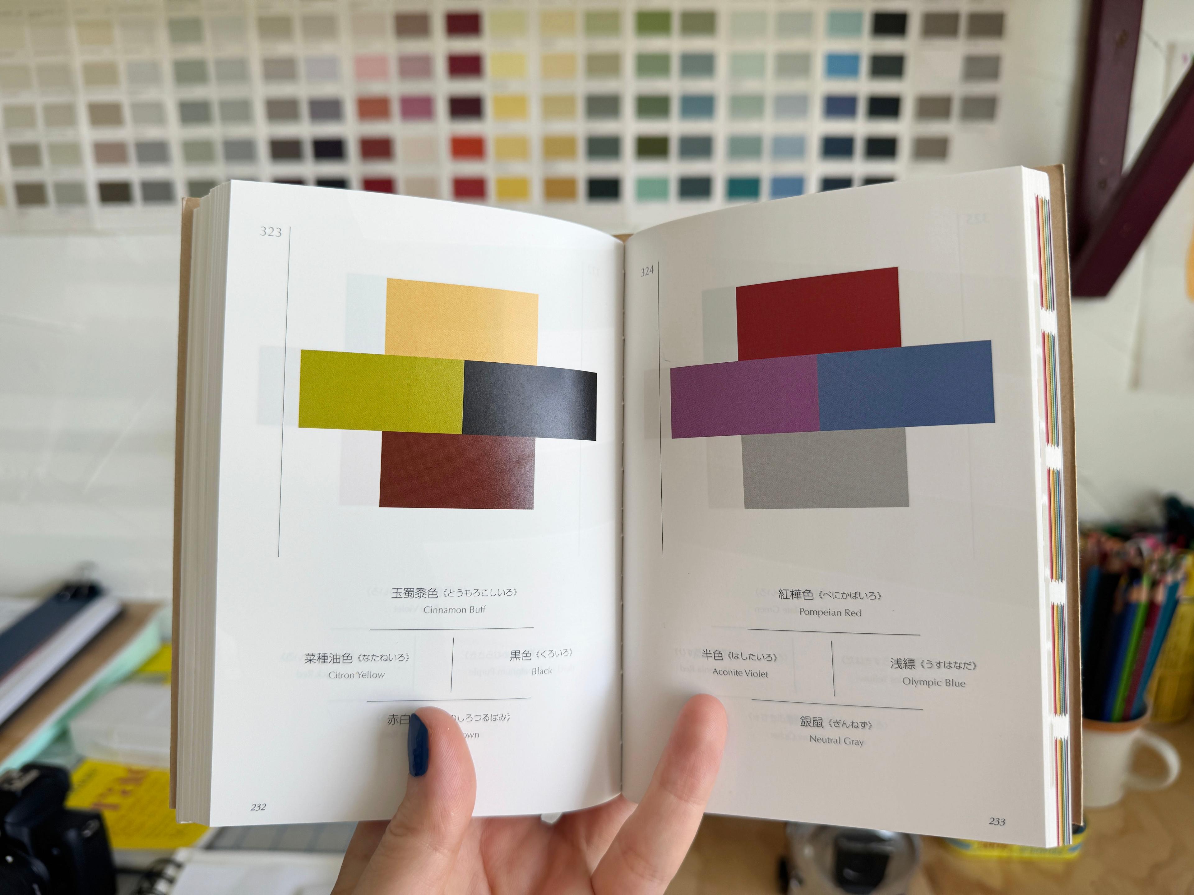
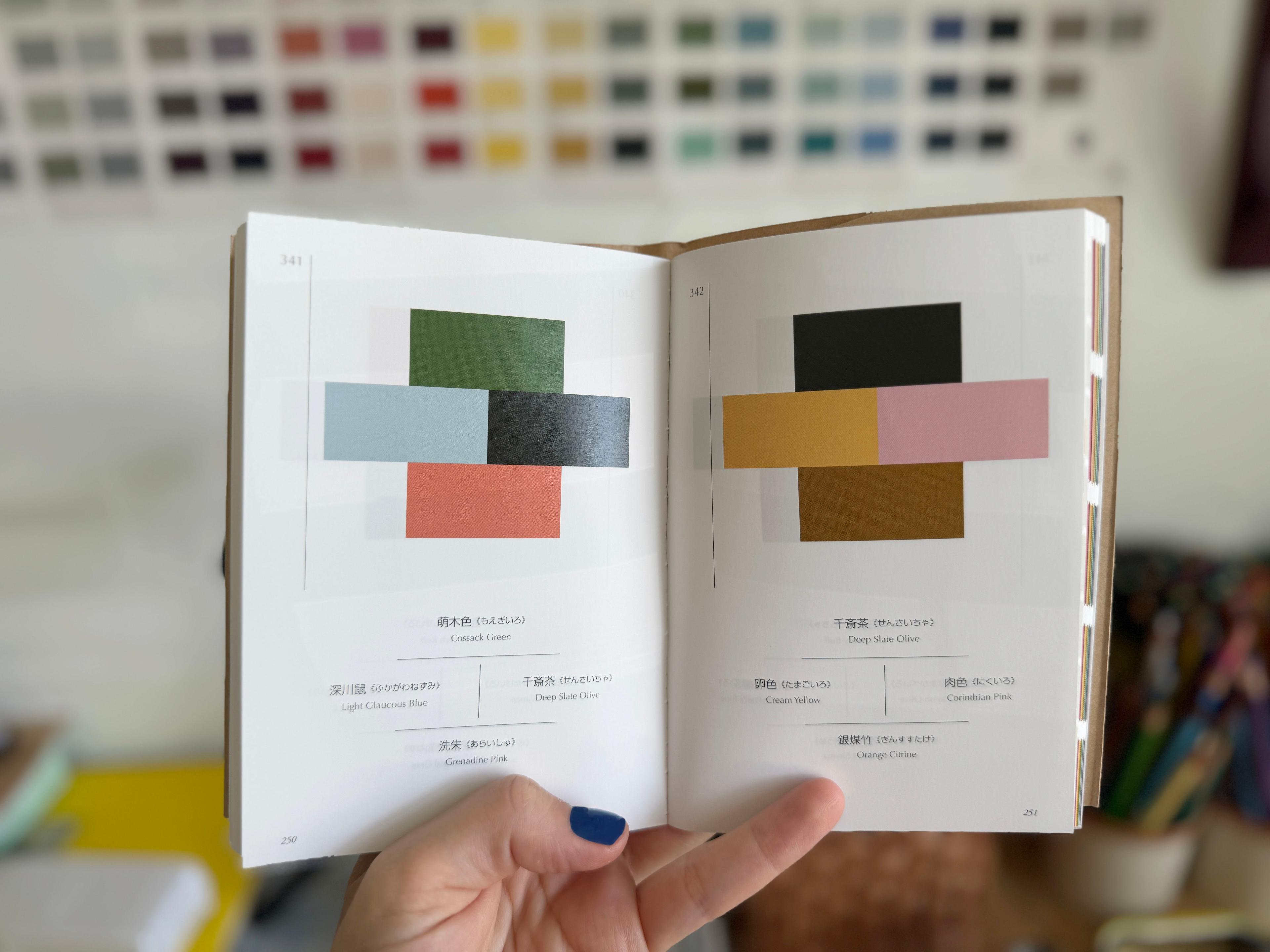
One I always return to when I’m feeling stuck or indecisive is a little book called A Dictionary of Color Combinations. It’s a compact guide (it truly fits in a small purse!) filled with palettes created by Japanese artist and designer Sanzo Wada in the 1930s. It’s basically a cheat sheet for pairing colors in unexpected, beautiful ways.
Featured Video
The book is essentially pages and pages of perfectly composed color trios and quartets—348 to be exact. No commentary or rules, just pure inspiration. You can flip through it like a mood board and see unexpected combinations that just work. Some color combinations are bold and some are subtle, but there’s guaranteed to be a palette that resonates with you on some level.
I turn to this book when there’s a color I’d like to work, but unsure how to build the rest of the palette. Or when I want to try something outside my color comfort zone—especially for mixing tones in textiles, art, and accessories.
Don’t Know Where to Start?
When I’m designing a room, I usually start with one “anchor” color—a piece that’s already there or already chosen. It might be a rug, a chair, a piece of art, or even a weird little vintage lamp. From there, I flip through the book with that color in mind, looking for palettes that use a similar tone and seeing what it’s paired with. Sometimes the combo surprises me, and that’s why I love this book so much. It takes me out of my comfort zone and pulls me into a world of possibilities.
The book reminds me that color doesn’t have to be a guessing game. It’s not always about having some magical gut instinct. It can be about experimenting, responding and testing things out. And I like knowing that even in the 1930s, someone was playing around with red and lavender and deep green in ways that still feel fresh today.
If you’ve been craving more color in your space but aren’t sure where to start, this book is a great place to begin. Start with what you already love, then let the combinations guide you from there.
With love,
Lu